H tags margin top headings
H Tags Margin Top
Style / Base / Heading

- Hits: 4
H Tags Margin Top
Style / Base / Heading
Style / Navbar / Nav / Nav Item
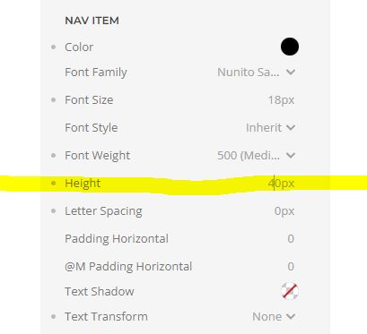
above and below the menu items - line height
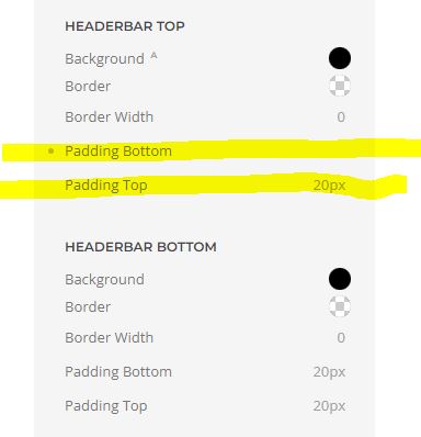
Remove padding from header area
Style / Theme / Headerbar Top
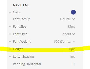
Main Menu - Nav Items
/*Centre nav items under themselves*/
.tm-header .uk-navbar-nav > li > a {
text-align: center;
}
Should you want align the text at the top, use this ruleset instead:
.tm-header .uk-navbar-nav > li > a {
display: flex;
align-items: flex-start;
text-align: center;
}
For the footer
.uk-nav-sub {
flex-direction: column;
align-items: center;
}
For the header
.uk-button:hover::before {
display: none !important;
}To remove the "strike-through" select
YOOtheme > STYLE > Components > Navbar > Nav Item Line > Mode: Disable,
Presumably you are referring to the "Page Border".
Try and set YOOtheme > STYLE > General > Theme > PAGE > Border Width: 0px.
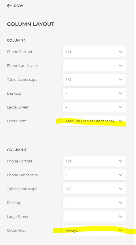
In the Row go to Edit Layout
For the second row to be first on a mobile put:
Column1 - order first / Medium (Tablet Landscape)
Column2 - order first / Always
open the Customizer, go to STYLE > Components > Navbar, pick your colour by setting Border: rgba(190, 175, 130, 1) (for example), set Border Width: 15px, and select Mode: Border.
If this doesn't work add CSS and style for a bottom border
/*header bottom border*/
.uk-navbar-container:not(.uk-navbar-transparent),
.uk-navbar-transparent {
border-bottom: #ff5b00;
border-bottom-style: solid;
border-bottom-width: 12px;
}
For top and bottom border
/*header top and bottom border*/
.uk-navbar-container:not(.uk-navbar-transparent),
.uk-navbar-transparent {
border-bottom: #9E9E9E;
border-bottom-style: solid;
border-bottom-width: 1px;
}

.uk-navbar-container:not(.uk-navbar-transparent),
.uk-navbar-transparent {
border-top: #9E9E9E;
border-top-style: solid;
border-top-width: 1px;
}