Padding Title Card Default primary secondary
Row / Edit Column X / Settings / Padding
Grid / Settings / Panel / Padding
- Hits: 10
Row / Edit Column X / Settings / Padding
Grid / Settings / Panel / Padding
Used with the Dennis Miller template.
YOOtheme > LAYOUT > Header > Dropdown:  Enable Dropbar.
YOOtheme > STYLE > Components > Dropbar > Background.
CSS if it doesn't work
.uk-dropnav-dropbar {
    background: #751310;
}How can i get the content I have added to positions in my header to show in my smaller screens and mobile views?
There are several possible approaches:
You could publish additional content via one or more modules (type "Builder" or other) set to Position: Logo Mobile [logo-mobile].
In a similar way, with modules, you could add content to the offcanvas/modal that is opened when the toggle (a.k.a. "hamburger") icon is clicked, by setting them to Position: Dialog Mobile [dialog-mobile].
To make the "Toolbar" show up for smaller resolutions you could add a customization. Navigate to YOOtheme > SETTINGS > Custom Code and into the field "CSS/LESS" insert the following CSS:
  .tm-page {
  display: flex;
  flex-direction: column;
  }
  .tm-toolbar.uk-visible\@m {
  display: block !important;
  order: -1;
}YOOtheme > LAYOUT > Site > Toolbar: Inherit transparency from header - centre content - width
STYLE > General > Theme > Toolbar > Background colour apply.
Adjust the Border Radius in whichever setting you are working on.
To extend the native "Slideshow" Builder element with a "Lightbox" feature, edit it and take these steps:
Click on the tab "Advanced" (that of the Slideshow, not that of an item!), scroll down to the field labeled "Attributes", and insert this line
uk-lightbox="toggle: a.el-link"
Scroll further down, and enter the following into the field labeled "CSS":
   .el-overlay, .el-link {
   padding: 0;
   width: 100%;
   height: 100%;
   }
   .el-link {
   position: absolute;
   display: flex;
   justify-content: center;
   align-items: center;
   }
Apply these in the tab "Settings":
<i uk-icon="icon:expand; ratio: 3"></i>, for instance, or a text like "Show image", for example, or it can be empty. NOTE: I have found you need something in the link text or the lightbox stops working. So something like ... if you don't want text showing.Edit the Grid Item, and in the tab "Content", field LINK > Dynamic > Article: ... select the same image you have selected for IMAGE > Dynamic > Article: ....
The image defined via "LINK" is the one which is supposed to be displayed in the Lightbox.
Save the changes, test the result.
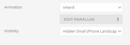
For larger screens to show
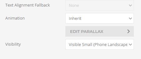
For smaller screens to show
/*padding to right of bullet points*/
.uk-list-bullet > ::before { left: -40px; }
.uk-list-bullet > * { padding-left: 40px; }
Index page bottom call to action.
Section add the image here / Edit settings (under the image)
Image size / Cover
Image Effect / Fixed
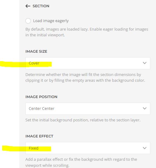
Section / settings /
Change the text colour light dark