Padding at the top of the slide out mobile menu offcanvas
Padding at the top of the slide out mobile menu
/* mobile menu offcanvas top padding */
.uk-offcanvas-flip .uk-open>.uk-offcanvas-bar {
padding-top: 60px;
}
- Hits: 21
Padding at the top of the slide out mobile menu
/* mobile menu offcanvas top padding */
.uk-offcanvas-flip .uk-open>.uk-offcanvas-bar {
padding-top: 60px;
}
Style / NavBar
Level up the dropdown text with the nav text
Dropdown
padding 0px
@Mshift Margin -20px
Margin either side of the item text when you have a divider that you want to go full width
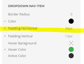
style / navbar / dropdown nav item
If you have two templates and need a different menu for each design.
You will need a login and a logout.
Create a new article category and an article for the new home page.
Create a new menu Menu2 and add the new page and an alias link back to website1 home.
Create a new Menu Module, Menu2, and 'Only on the pages selected' selected the pages on Menu2, but not the link back to Template1 home.
The default Template Style, Template1 should still be set to Pages, ‘default for all pages’
Created a New Template Style, Template2 selected to show on the Menu2 Pages and the link to the new template from the original menu, but not the link back to the Template1 site.
In the Menu1 Module set 'Only on the pages selected' and selected all the pages except Menu2 Home.
YOOtheme Templates
In the Menu1 template set Menus / NavBar Position Menu1
In the Menu2 template set Menus / NavBar Position Menu2
Make a To Top element in the footer:
go to the tab Advanced in the element
/*make the button sticky at the bottom*/
.uk-totop {
position: fixed;
bottom: 20px;
right: 20px;
z-index: 1;
}
Then make the To Top disappear at the top of the page and appear on scroll!!!
Navigate to YOOtheme > SETTINGS > Custom Code, and into the field labeled "SCRIPT" insert the following:
Then if it doesn't work add this
Into the field "CSS/LESS" insert the following CSS to make the To Top fade away:
  html[data-scroll="0"] .uk-totop {
  opacity: 0;
  transition-property: opacity;
  transition-duration: 600ms;
  }
Or alternatively just hide it:
  html[data-scroll="0"] .uk-totop {
  display: none;
  }
YOOtheme answer:
https://yootheme.com/support/question/167313#answer-540905
This was the original to top css, the above has worked better for me.
  .el-element {
      position: fixed;
      bottom: 20px;
      right: 20px;
      z-index: 1;
  }
/*toggle icon on mobile background colour and space*/
.uk-navbar-toggle {
padding: 0px 15px 0px 15px;
background-color: #DDF3F5;
margin-top: 10px;
margin-bottom: 10px;
}
Good for very long questions that run to 2 or more lines.
Add the CSS to the page as it stops the title in the panel element from centering.
/*force the title into the middle of the row. */
accordion
.el-title {
display: flex;
align-items: center;
}
.el-title {
margin:0 auto;
}
/* Change the mobile menu navbar container background color to white */
.tm-header-mobile .uk-navbar-container {
background-color: white;
}
/*added padding to buttons having lessened the line height for longer button content*/
.btn-info, .btn-primary, .btn-success, .uk-button-primary {
line-height: 1.6;
padding-bottom: 10px;
padding-left: 60px;
padding-right: 60px;
padding-top: 10px;
}
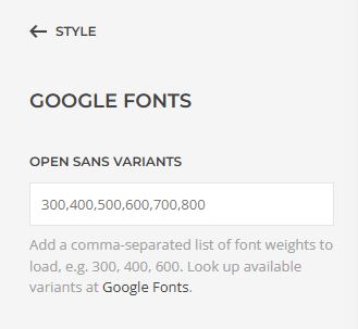
Make sure the Google Font sizes have been loaded into Style / Google Fonts Variants
/* 1. Main menu - active menu item bold without jumping*/
.uk-navbar-nav > li.uk-active>a {
font-weight: 700;
letter-spacing: 0.4px;
}
/* 2. Main menu - hover menu item bold without jumping*/
.uk-navbar-nav > li:hover > a {
font-weight: 700;
letter-spacing: 0.4px;
}
/* 3. Main menu Drop down sub menu - active menu item bold without jumping*/
.uk-navbar-dropdown-nav>li.uk-active>a {
font-weight: 700;
letter-spacing: 0.4px;
}
/* 4. Main menu Drop down sub menu - hover menu item bold without jumping*/
.uk-navbar-dropdown-nav> li:hover > a {
font-weight: 700;
letter-spacing: 0.7px;
}
/* 5. Mobile menu - active menu item bold without jumping*/
.uk-nav-default> li.uk-active>a {
font-weight: 700;
letter-spacing: 0.4px;
}
/* 6. Mobile menu - hover menu item bold without jumping*/
.uk-nav-default> li:hover > a {
font-weight: 700;
letter-spacing: 0.4px;
}
/* 7. Mobile Drop Down Sub menu - active menu item bold without jumping*/
.uk-nav-default .uk-nav-sub li.uk-active>a {
font-weight: 700;
letter-spacing: 0.4px;
}
/* 8. Mobile Drop Down Sub menu - hover menu item bold without jumping*/
.uk-nav-default .uk-nav-sub li:hover > a {
font-weight: 700;
letter-spacing: 0.4px;
}
/* change the FAQ accordion to icon left*/
.uk-accordion-title::before {
float: left;
}