
Module class - change color of link in a module

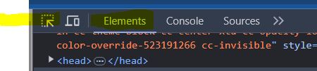
This is from the header of chimney sweeps surrey.

<p style="text-align: right;"><span style="color: #ffffff; font-size: 18pt;">Covering Surrey, South West London & North Hampshire<br /></span> <span style="color: #ffffff; font-size: 18pt;"> <img src="/images/graphics/whitetelephone30.png" alt="whitetelephone30" width="30" height="30" />  <a href="tel:01932 227 143">01932 227 143</a> <br /></span><span style="color: #ffffff; font-size: 18pt;">family run business for ♥ over 100 years</span></p>

Make up a word for your class, in this case 'white', and add it into:

Modules / Advanced / Module Class

In Yootheme, go to settings  / CSS

and add the chanage to the style that you want:

/*module class link of phone number in header*/
.white a { 
    color: #ffffff;
}

Save and test.

  • Hits: 3

html code for buttons hover and link hover

This was on Biomin voco slider

Onto the code of the page, html

 <button class="greenol-button">Your text here</button>

Into the CSS Style sheet put

/* green outline background Button design */
.greenol-button, {
color: #2FA836 !important;
font-size: 16px;
background-color: #fff;
border-color: #2FA836 !important;
border-width: 1px !important;
border-style: solid;
border-radius: 5px !important;
padding: 10px;
}

.greenol-button a {
    color: #2FA836 !important;
    cursor: pointer;
    text-decoration: none;
}

.greenol-button:hover {
    color: #fff !important;
	background-color: #2FA836;
    border-color: #2FA836 !important;
    cursor: pointer;
    text-decoration: none;
    padding: 10px;
}

.greenol-button:hover a{
    color: #2FA836 !important;
}


/* green background Button design */
.green-button, {
color: #fff !important;
font-size: 16px;
background-color: #2FA836;
border-color: #2FA836 !important;
border-width: 1px !important;
border-style: solid;
border-radius: 5px !important;
padding: 10px;
}

.green-button a {
    color: #fff !important;
    cursor: pointer;
    text-decoration: none;
}

.green-button:hover {
    color: #2FA836 !important;
	background-color: #fff;
    border-color: #2FA836 !important;
    cursor: pointer;
    text-decoration: none;
    padding: 10px;
}

.green-button:hover a{
    color: #2FA836 !important;
}

  • Hits: 10

CSS to line up text items bullet point list Prestashop

This will work when you add it to the theme template

/*basic unordered list design*/

li {
     color: #000;
     font-size: 16px;
     text-indent: -22px;
     padding-left: 26px;
}

However this code needs to go into the actual element where the bullet points are located

/*Wrap lines to line up under the first line*/

#cms selector ul {
text-indent: -22px;
padding-left: 20px;
}

To add space between bullet sections

ul li { padding: 5px 0px; }
  • Hits: 11

inspect a roll over hover element for CSS

Hit F12 to open the inspect tool.

Click on Source

source

Hover over the element you want to inspect and activate it then press F8 the screen will go dark.

Now click onto Elements and then click on the select arrow icon.

element

Click on the element you want to inspect.

inspect


  • Hits: 20